
Apothecary 87 - Rebranding for a premium packaging experience
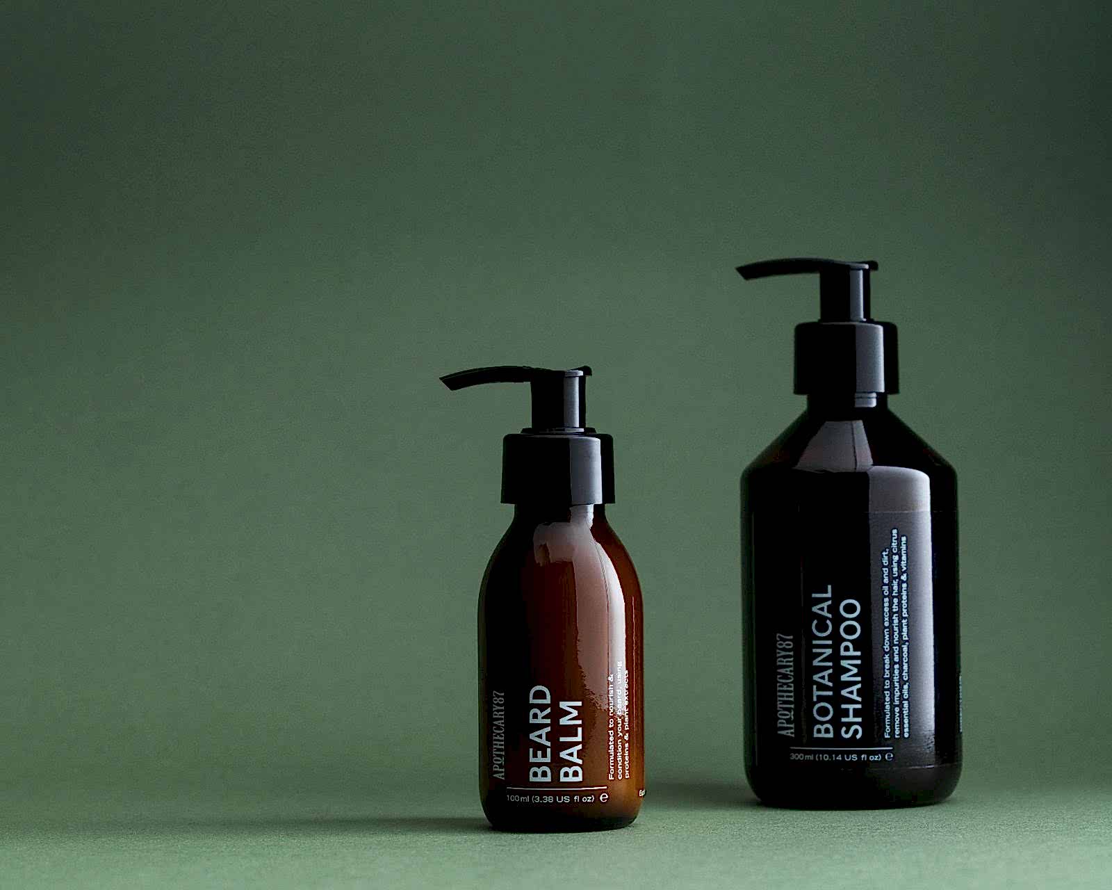
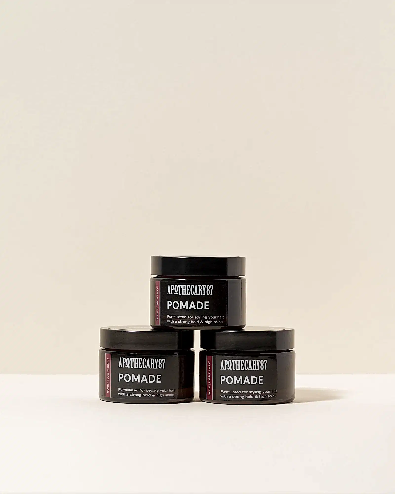
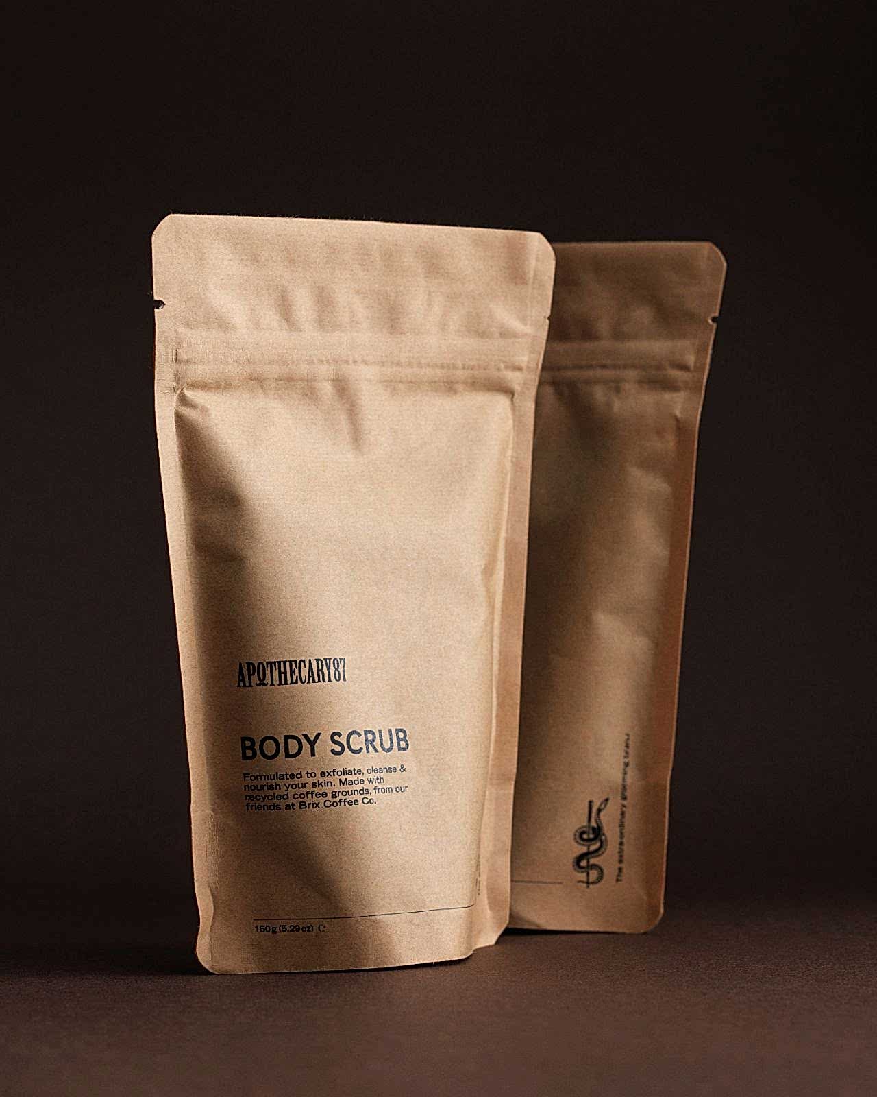
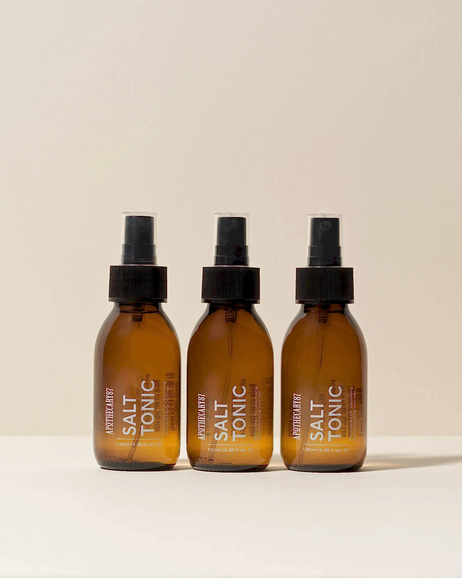
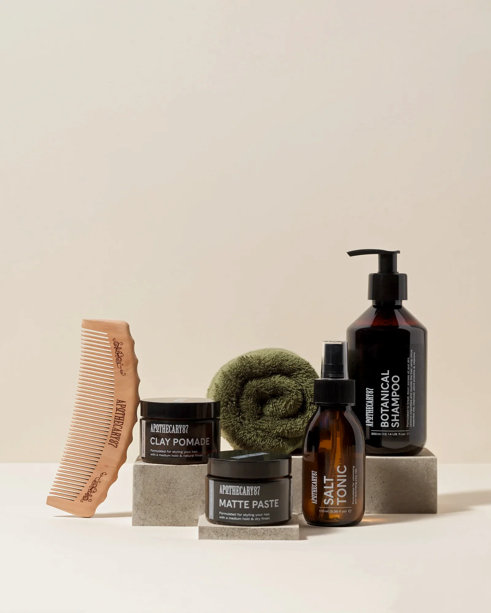
93 worked with, natural skincare and grooming brand, Apothecary 87 to elevate their existing range of products using impactful packaging design, typography and a new brand identity.
Elevating the brand to open it up to a wider audience
After building a successful business around his collection of natural, cruelty-free grooming products, Apothecary 87 founder Sam Martin was ready to take the company to the next level with a premium rebrand.
The 1920s prohibition, 'Peaky Blinders' style vintage aesthetic he had started out with, which was current at the time, no longer reflected the aspirations and ambitions of the evolving business and natural skin and hair brand.
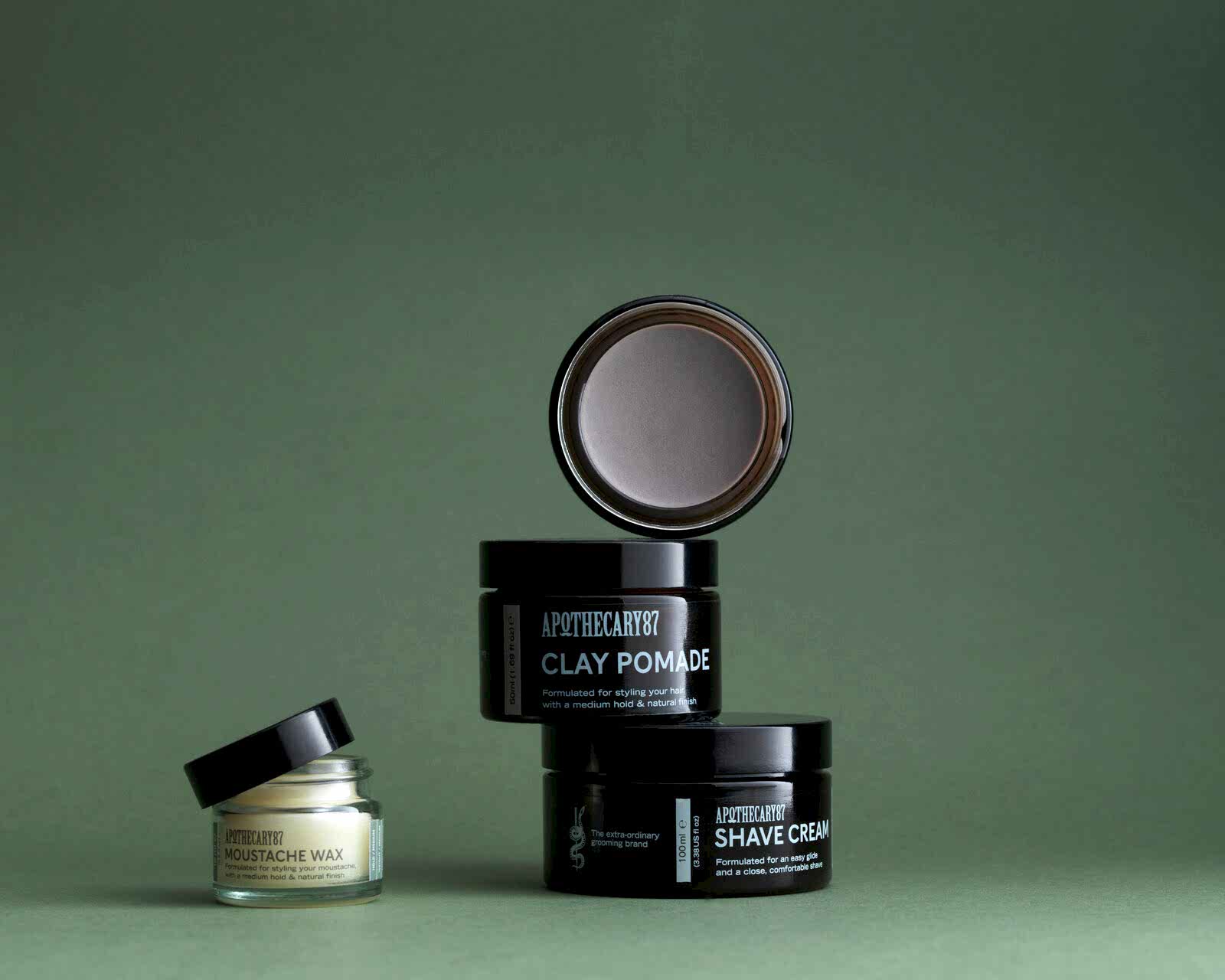
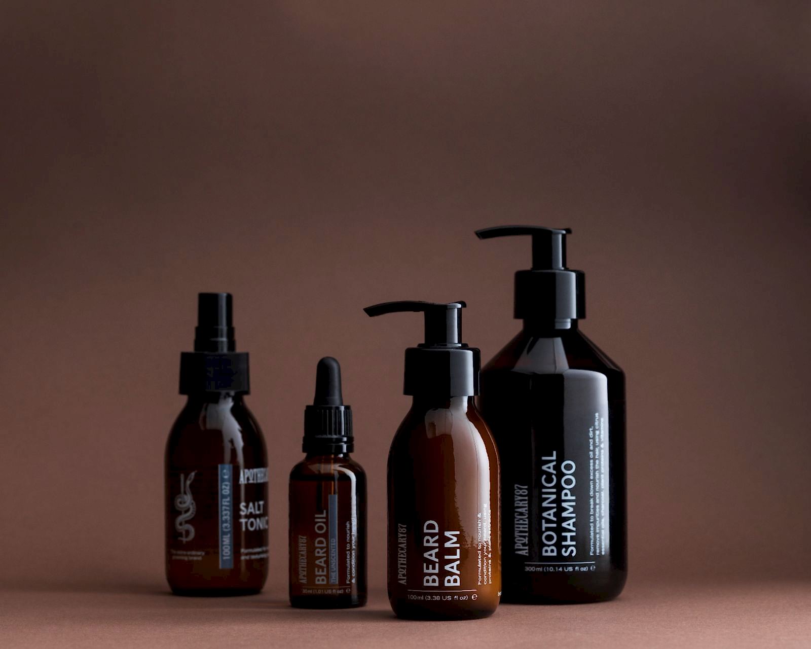
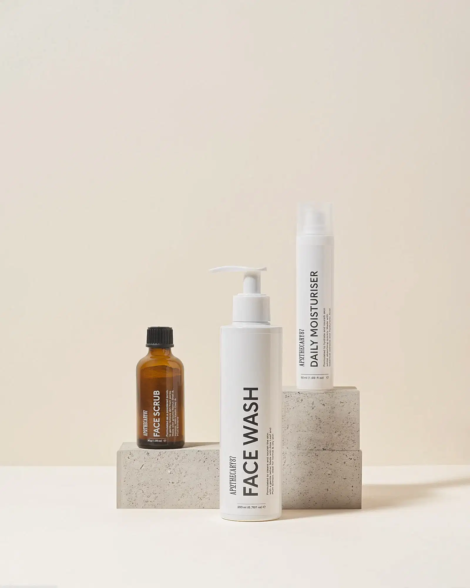
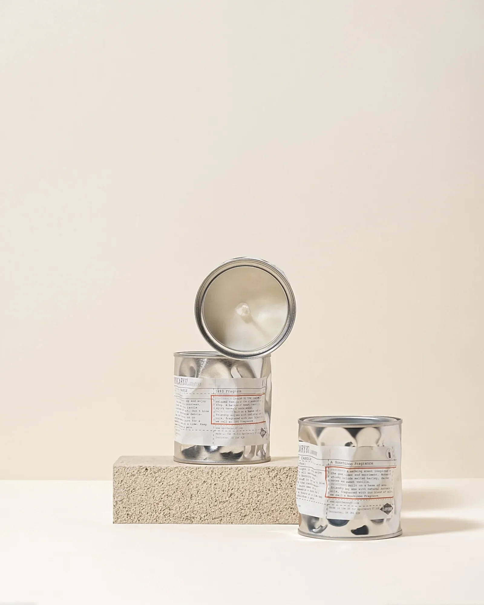
We wanted to create a simple packaging template style that could be easily applied to multiple formats and adhere to a rigid graphic design structure, making it easy for Apothecary 87 to use it across the existing range as well as apply it to any new product development in the future.
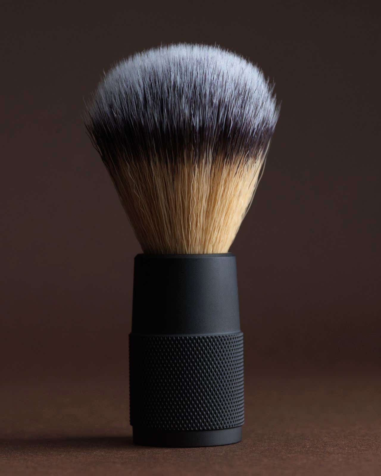
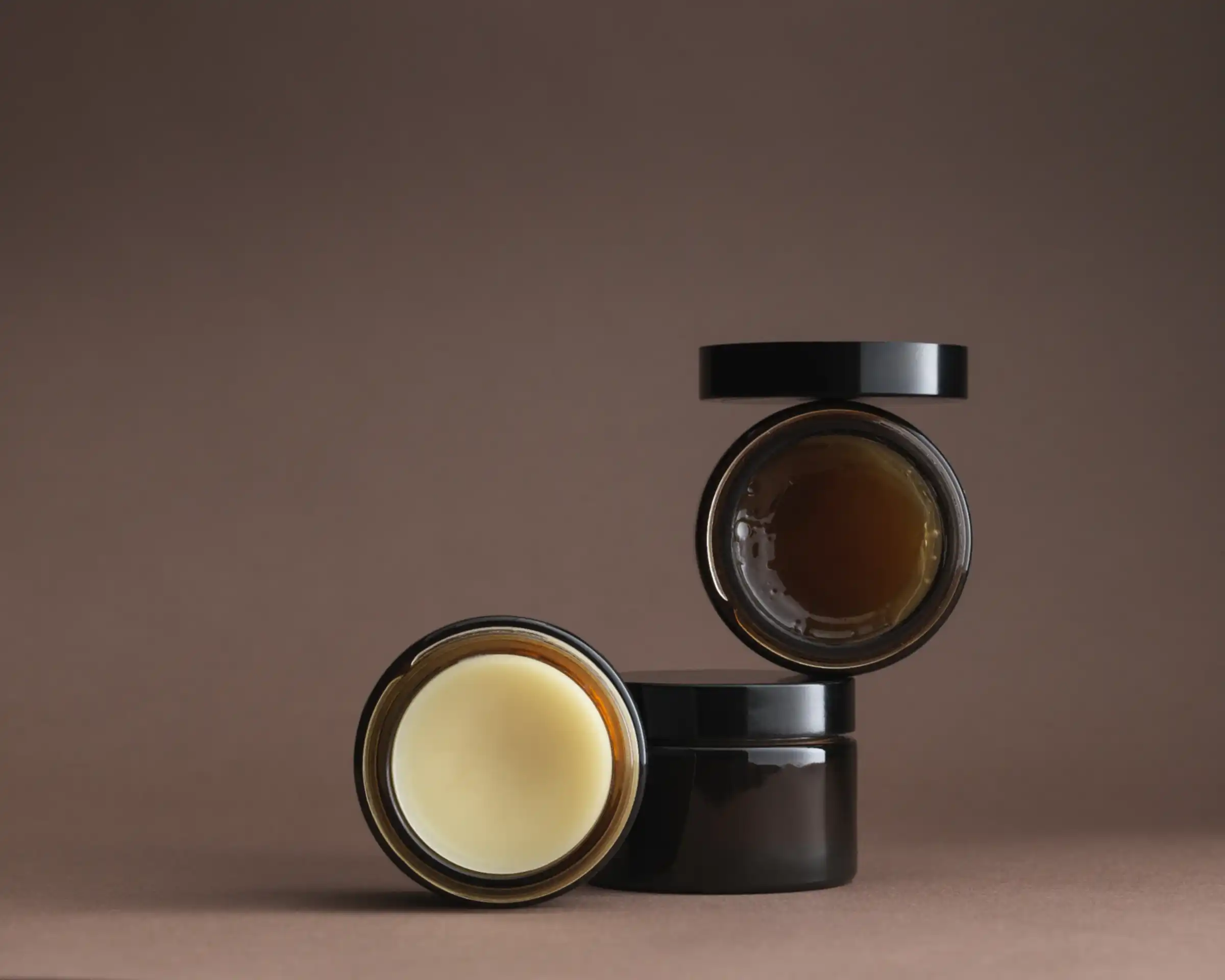
We identified the need to pare back the branding in order to give it a more premium feel and appeal to a discerning audience who want a product that not only performs on their skin and hair incredibly well, but accompanied with packaging that looks incredible in their home.
Strategising a new packaging design direction for Apothecary 87
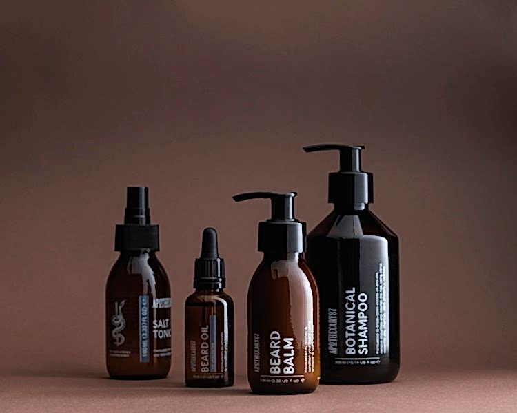
We wanted to maintain a vintage look that gives a reassuringly well established feel, while modernising the brand. We strategised the use of a strong typographic style, with structure and symbolism to bring a more graphic aesthetic that feels fresh and natural for a premium audience.
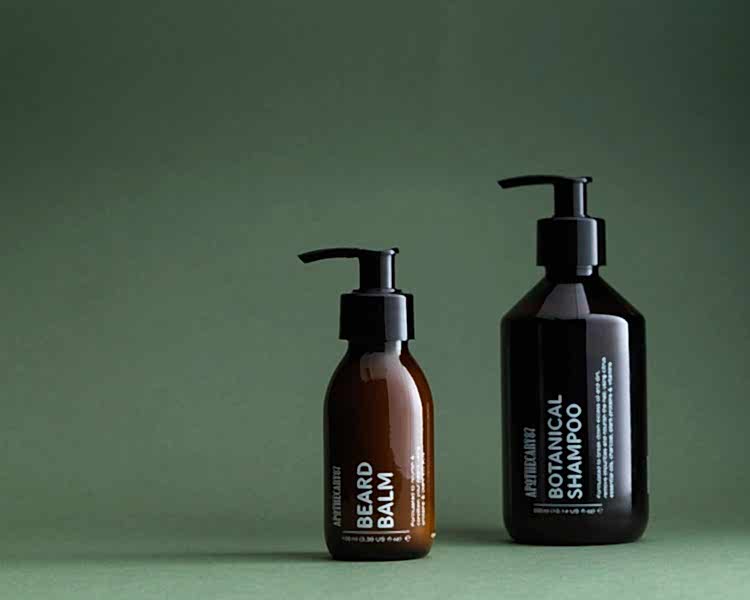
We believe that any design is only as good as it is functional - a beautiful style that doesn’t fulfil its purpose is a poor design in our book, so everything we create has to work well as well as look great. Creating user friendly labelling was high on the agenda, ensuring sub categories within headline categories was key. We introduced colour coding into the packaging for ease of recognition which also added shelf appeal. We also created a range of simple icons for use on the edge of each packaging to highlight the key features of the product, making it easy to select the one that meets the needs of the individual customer.
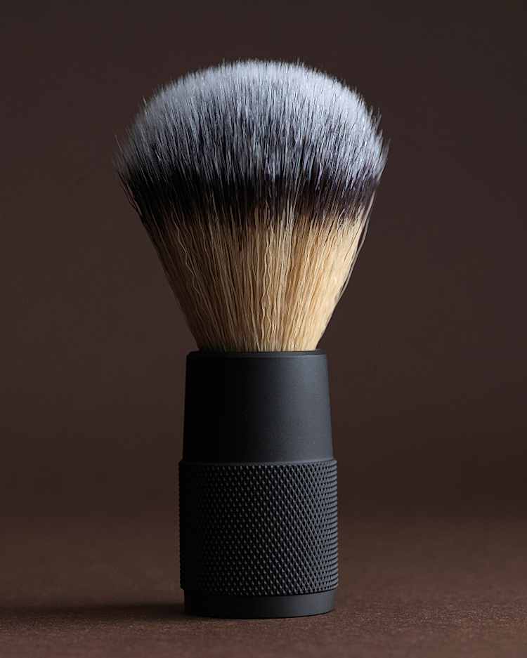
We gave the packaging a new-vintage look, harking back to a time when grooming and creating a dapper look were an essential part of any man’s daily routine, while maintaining a modern feel that reassures the customer that these products are natural and cruelty free.
Keeping the design simple and fresh, highlights the natural and performance based formulation of the entire product range.
Traditional symbolism to underpin a fresh new identity
A snake wrapped around a staff has been a symbol of the apothecary industry since the time of the Ancient Greeks. Aesculapius, one of the Greek Gods of medicine, was often depicted carrying a staff with a snake coiled around it - the snake being the symbol of wisdom, immortality and healing in Middle and far Eastern cultures far older than that of ancient Greece. The snake wrapped around the staff became a widely used medical symbol around the fifth century BC. We were keen to make use of this ancient and instantly recognisable symbol to pay homage to the natural ingredients and the care given to the formulation of Apothecary 87’s products.
The Apothecary 87 team are enthusiastic aficionados of tattoo art, especially the trad style - a fact which played nicely into the traditional symbolism of the snake and staff, and lent extra weight to its use. To give the symbol a modern twist and make it an authentic Apothecary 87 asset, we referenced the baseball bat displayed in the Apothecary 87 headquarters to replace of the traditional wooden staff, resulting in a logo that’s both traditional and contemporary, instantly recognisable and unique.
Typography
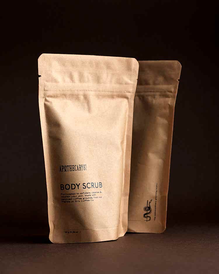
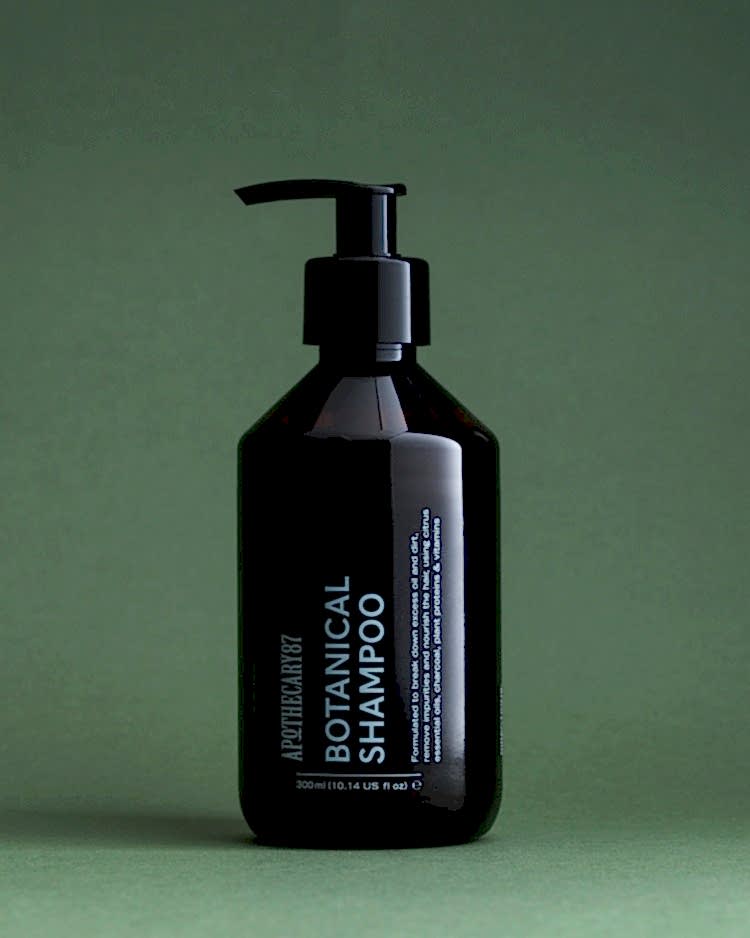
Typography is an element of brand design which should not be undervalued. While the colour palette or logo of a business may be what a customer would describe about the brand - think Coca Cola’s iconic red and white, or the “golden arches” of McDonald’s - typography is a more subtle reminder of the brand. A font that’s incongruous with the brand gives a feeling of discomfort that’s hard to pinpoint, while a harmonious typeface lets the viewer know they’re in the right place.
With this in mind, the use of typography was a crucial part of getting the new look right. We selected two complimentary fonts which can be used across the brand, with each having their own unique nod to "vintage".
Our headline font is based on old hand painted road signs from a pre-war era Britain. Its interesting letterforms and quirks make it a visually engaging choice that, as always, has a robust rationale behind its choice.
Our text font, chosen for its modernist mid-century flavour is clear and easy to read, making it a perfect choice for labelling.
Is your brand ready to be elevated to a new, premium audience?
We’re experts in branding and rebranding, creating strong brand identities, packaging design, logos and typography, and we’d love to chat about how we can help you and your business open up to new audiences.
Latest Projects
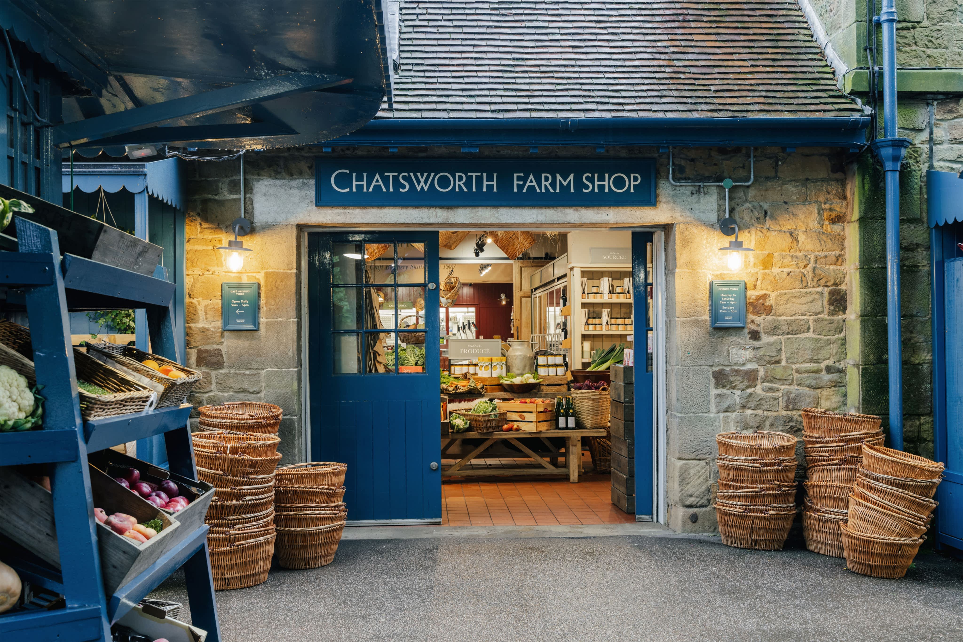
Chatsworth Farm Shop – how a revitalised brand experience can help elevate an established rural business
When it comes to brand experience, it’s not always about starting from scratch. If the heritage and advocacy is already in place, it’s a simple case of elevating, not fixing. The refreshed look and feel for Chatsworth Farm Shop celebrates its connection to the wider Chatsworth Estate, and renews its relevance for loyal customers for many years to come. Find out more
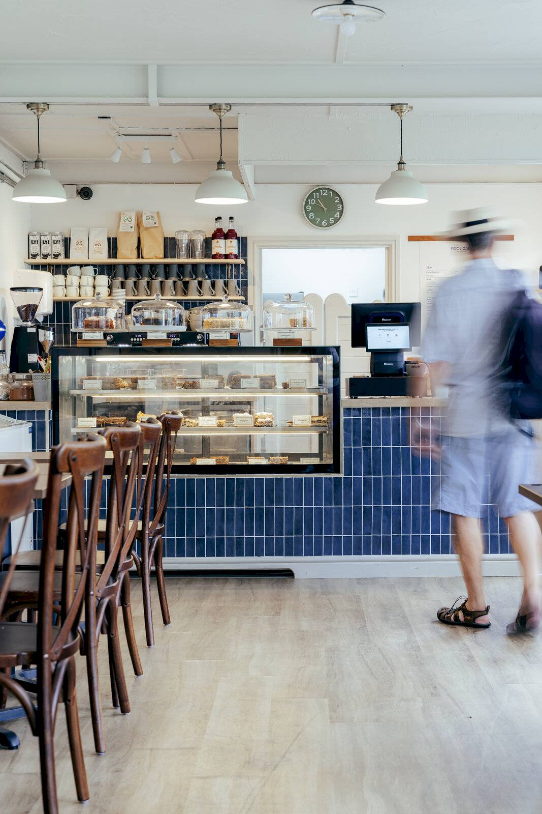
Hathersage Pool Cafe – An improved brand experience through refreshed interior design and brand identity
93ft recently completed an interior design and brand identity project to refresh the look and feel of Hathersage Pool Cafe, helping to positively impact the overall experience of the picturesque Peak District swimming spot for its many visitors throughout the year. Find out more

Kangaroo Works – Turning Sheffield industrial heritage into a modern brand and interior build-to-rent for its community of rental residents
93ft worked on the interior design and brand identity for Kangaroo Works, a mixed-used, residential development forming part of Sheffield city centre Heart of the City II regeneration. With a rich history and cultural heritage to explore, the 93ft team created an experience for residents that felt grounded in place and culture. Find out more
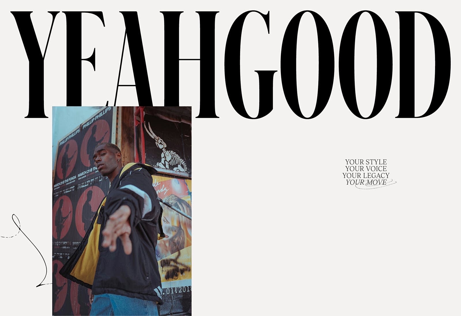
YEAH GOOD – Creating a bold brand identity that champions self-expression
Image isn’t everything, but it is Laura Simons’ thing. 93ft was tasked with executing a confident brand identity that enabled YEAH GOOD to make an ambitious statement of intent. Find out more


