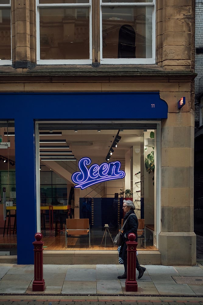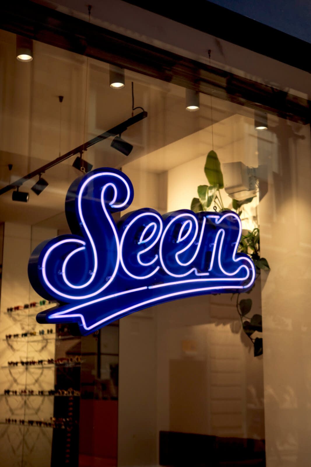
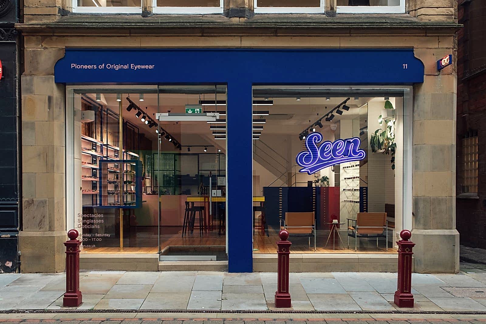

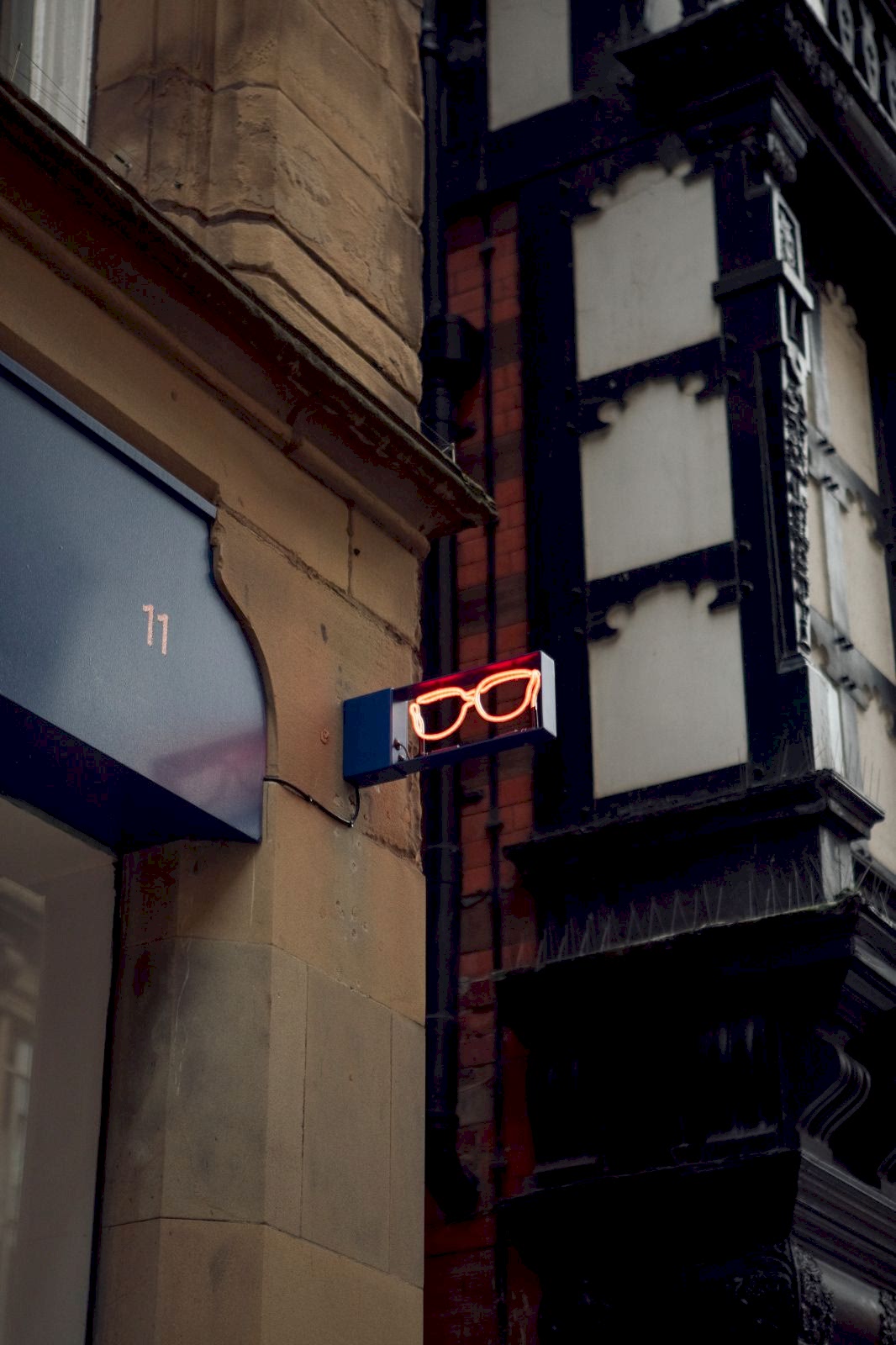
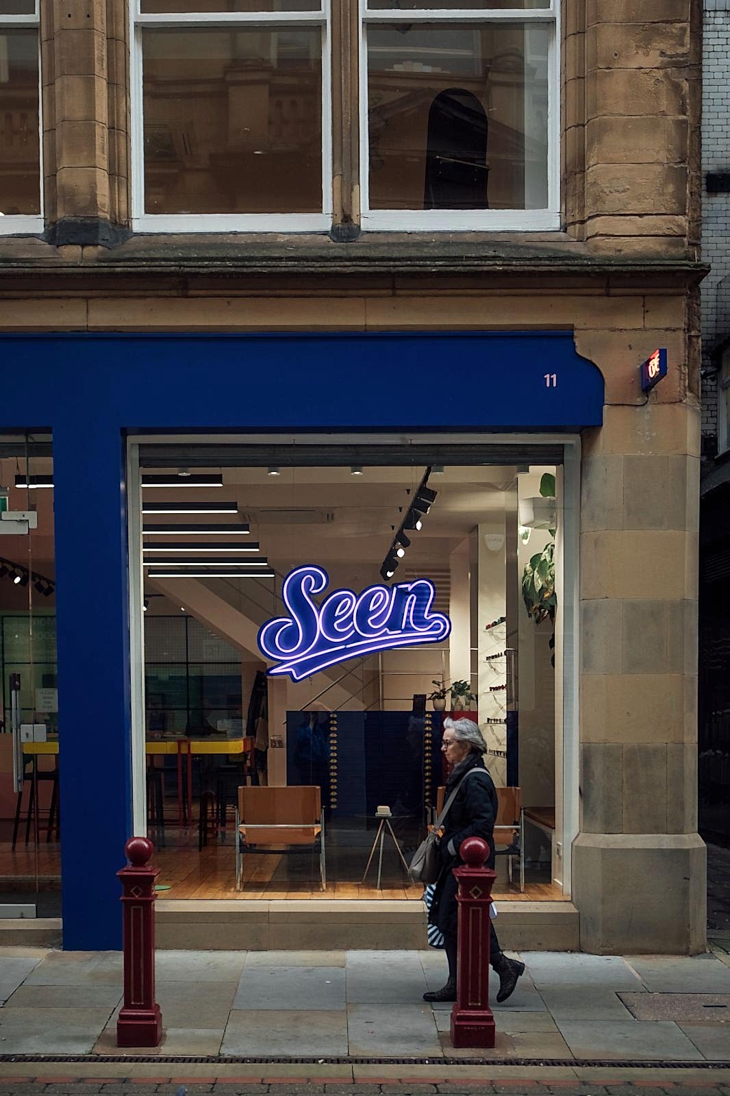
Seen Opticians - Creating a modern Manchester storefront featuring real neon signs and authentic hand painted sign writing
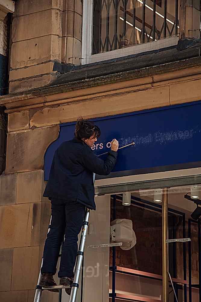
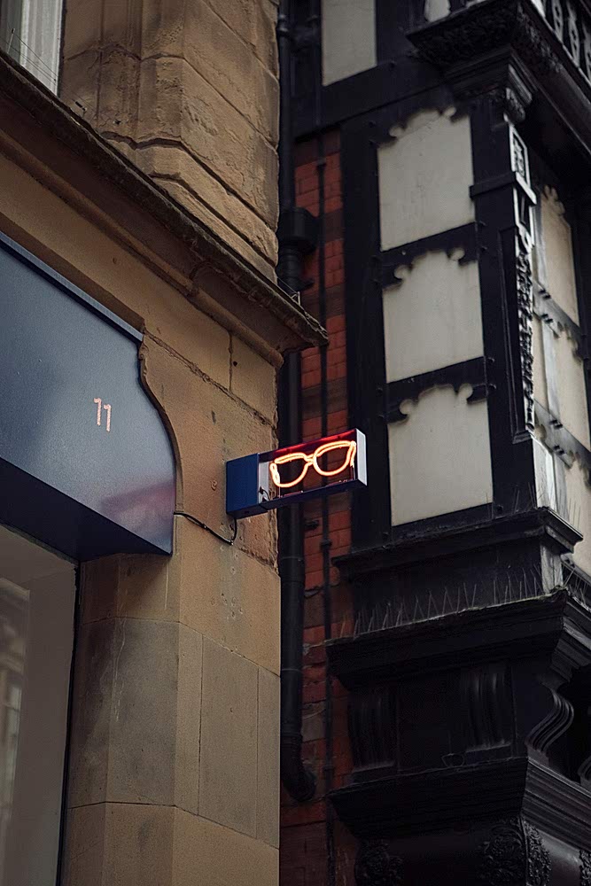
How real neon signage, handpainted sign writing and creative illustration are brought together to create a timeless and eye-catching shopfront proposition for Seen Opticians' new address in Manchester.
Using artisanal artwork to catch the eye on the high street
100 years ago every storefront featured a hand painted sign, every piece of marketing material from leaflets to billboards was illustrated and (almost) 100 years ago businesses were just beginning to take note of the new craze: glass neon tube advertising. These traditional skills were ubiquitous - there simply wasn’t any other way to advertise your business and stand out amongst your competitors.
The age of plastic fantastic began in earnest in the 1960’s when this new wonder material - which offered a cheap, versatile and hygienic alternative to traditional recyclables such as glass, wood and metal - became a must-have for manufacturers and consumers alike. As tastes changed, traditional skills fell out of fashion and favour, leading to a copy-and-paste feel with every shop featuring a plastic sign and even the once exciting and high tech neon filled tubes being replaced by coloured plastic lookalikes otherwise known as faux neon.

In recent times, with environmental concerns growing by the day, we’ve witnessed a sea change in the perception of these so-called old fashioned skills. As the popularity of “granny skills” such as hand-mending and yarn crafts rise like an artisanal sourdough, consumers are rejecting plastics in favour of a return to authentic craftspersonship.
Change doesn’t happen overnight, though. Using traditional methods of showcasing your bricks-and-mortar business is still a stunningly effective way of standing out on the high street.
Creative partnerships - Celebrating a decade of 93ft and Seen Opticians
At 93ft we pride ourselves on our longstanding relationships with our clients. The years spent working together say more about the work we do and the results we get than anything else could. We’re proud to have worked with Manchester based Seen Opticians for a decade now, dating back to our work on their branding in 2012.
Seen Opticians have always been about doing things differently. Their look, their values and their USP are based on individuality with a premium feel.
Similarly, 93ft have always been about authenticity first. Our clients value our willingness to do things differently, to stand out from the crowd with timeless design rather than trend-led identikit offerings. We tear up the rulebook every single time, rewriting it to create something that fits our client’s needs perfectly, taking them from run of the mill to a business that really stands out.
In-house design supported by a vibrant network of independent artists
Our in-house design team works their magic on many of our projects, but we know when we need to call in a specialist skill. We cultivate a thriving network of artists from film makers to illustrators and are proud to showcase and support their talents.
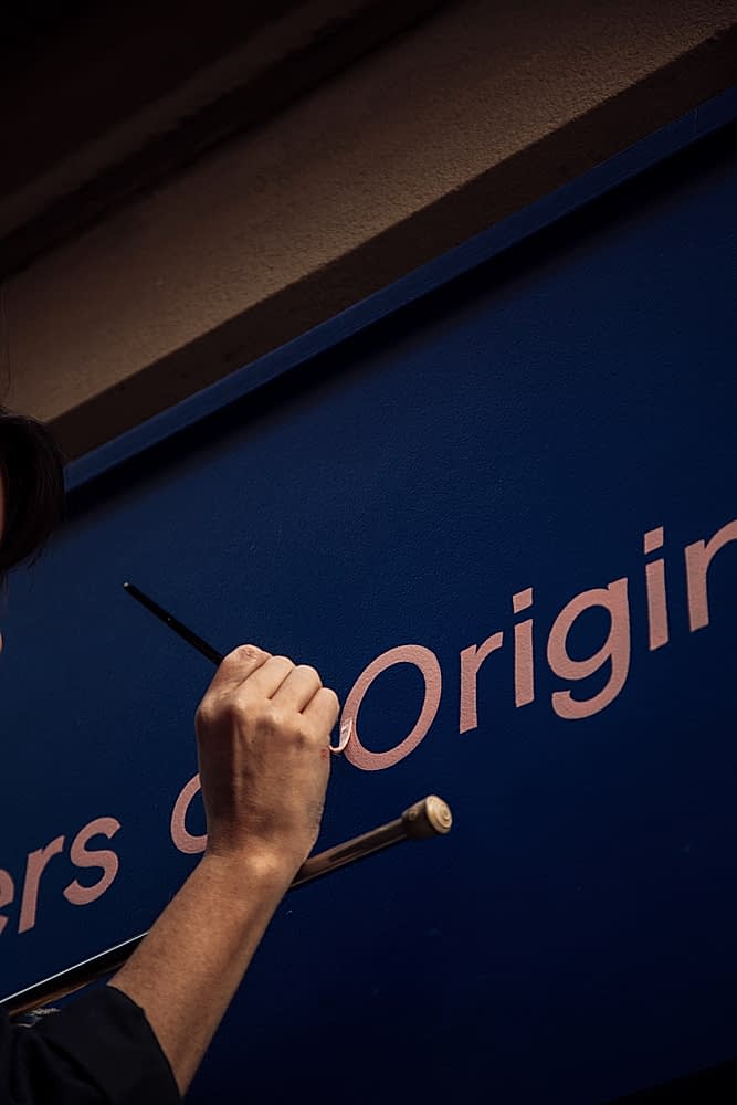
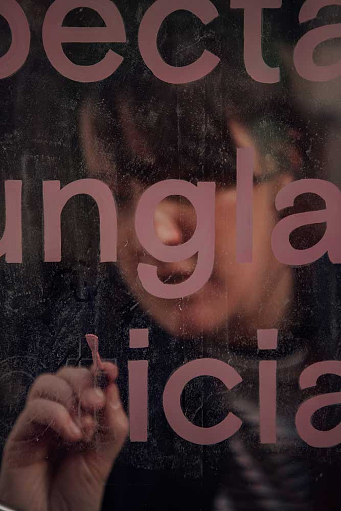
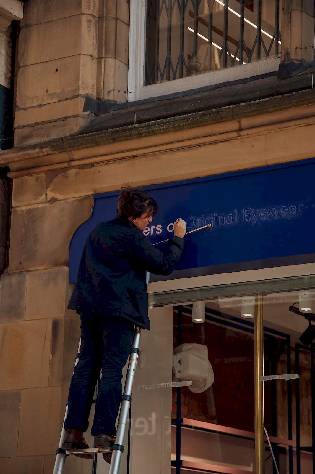
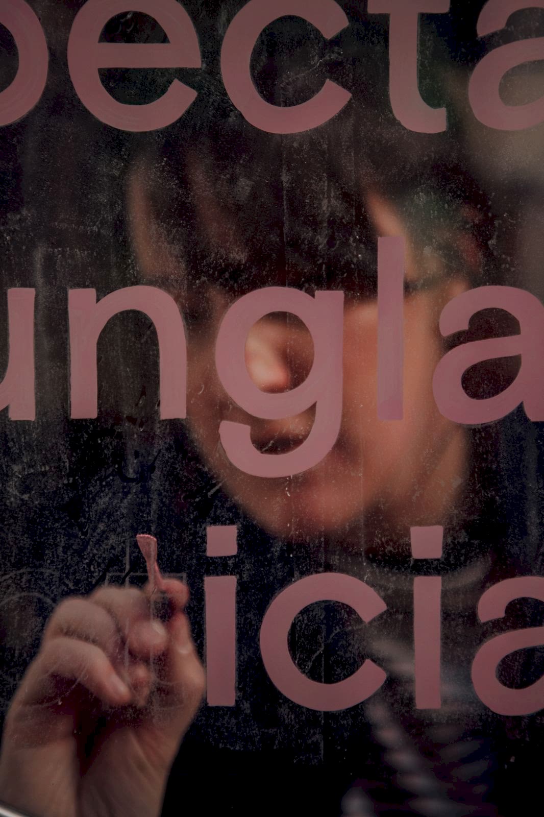
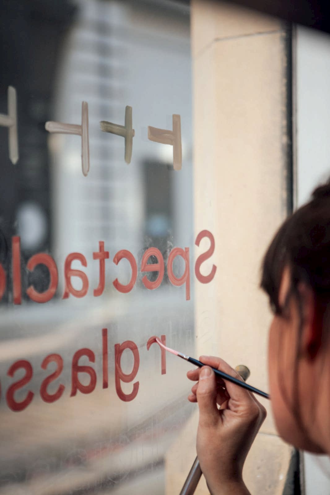
Mia Warner is a traditional sign painter, calligrapher and hand-lettering artist based in Sheffield. We’ve worked with Mia on numerous occasions, including Marmadukes beautifully gilded window and True Pizzas’ old-school casual “slap” lettering - projects which are testament to her versatility.
Seb Agresti is a designer and illustrator based in the Netherlands. His playful style takes key elements of a scene or concepts and simplifies them, picking out the key details that bring it alive.
Neon Workshops, based in Wakefield, specialise in real hand formed neon glass tube advertising. They’re passionate about their work, seeing the importance of ensuring that the public are aware of the difference between handcrafted glass and the less beautiful LED plastic products. Neon Workshops are our go-to when we need to provide our clients with something truly iconic - like the Marmadukes bear on a bike.
Bringing together 3 unique artistic mediums to create a truly authentic retail experience
Taking over the creative direction of a project is all part of the service at 93ft. We knew that any one of these elements - traditional neon, hand painted signage or unique illustration - would’ve given Seen Opticians the upper hand on the high street, setting them apart from their competitors. Using all three creates a totally authentic look and feel for the store that simply will not be seen elsewhere.
The three different crafts complement one another perfectly, with Mia’s delicate, nostalgic hand painted script being reflected in Seb’s illustration and Neon Workshop’s beautifully hand formed glass. This consistency of branding across all mediums, both online and in-store, is vital for an instantly recognisable look - part of our creative direction is to ensure that different elements tie together well, resulting in a cohesive brand feel.
Reviving traditional skills - why bother?
Supporting independent artists and businesses is vital if we want to build a marketplace where true authenticity is valued over production lines. Hand painted signs, illustrations and traditional neon have an artistic appeal which is impossible to recreate in mass produced items; as Mia Warner states, “They bring that heart and soul to the brand, the message or the overall aesthetic.”
While these skills should be retained for the sake of our history and the nostalgia factor, ensuring that they’re not lost makes great business sense, too. In an overcrowded marketplace with an internet that’s full of businesses shouting their worth, anything that makes your business stand out and get noticed is invaluable.

Independent artists, especially those using traditional crafts and skills, may also be the environmentally responsible option. A sign painted onto glass is much more eco friendly than a vinyl sign (which may fade or crack in the elements and need replacing within a few years). Neon filled glass tube advertising can last for decades and can be easily repaired and recycled at their end of life, unlike plastic and LED signage which contain toxic chemicals, making them much more difficult to recycle and recover the materials used.
For many businesses, their Environmental, Social and Governance strategies (ESG) are an increasingly important feature in the process of identifying suppliers and materials, so these greener options are becoming the obvious choice.
Talk to us about how traditional and plastic free sign design could become part of your brand story, get in touch
Latest Projects
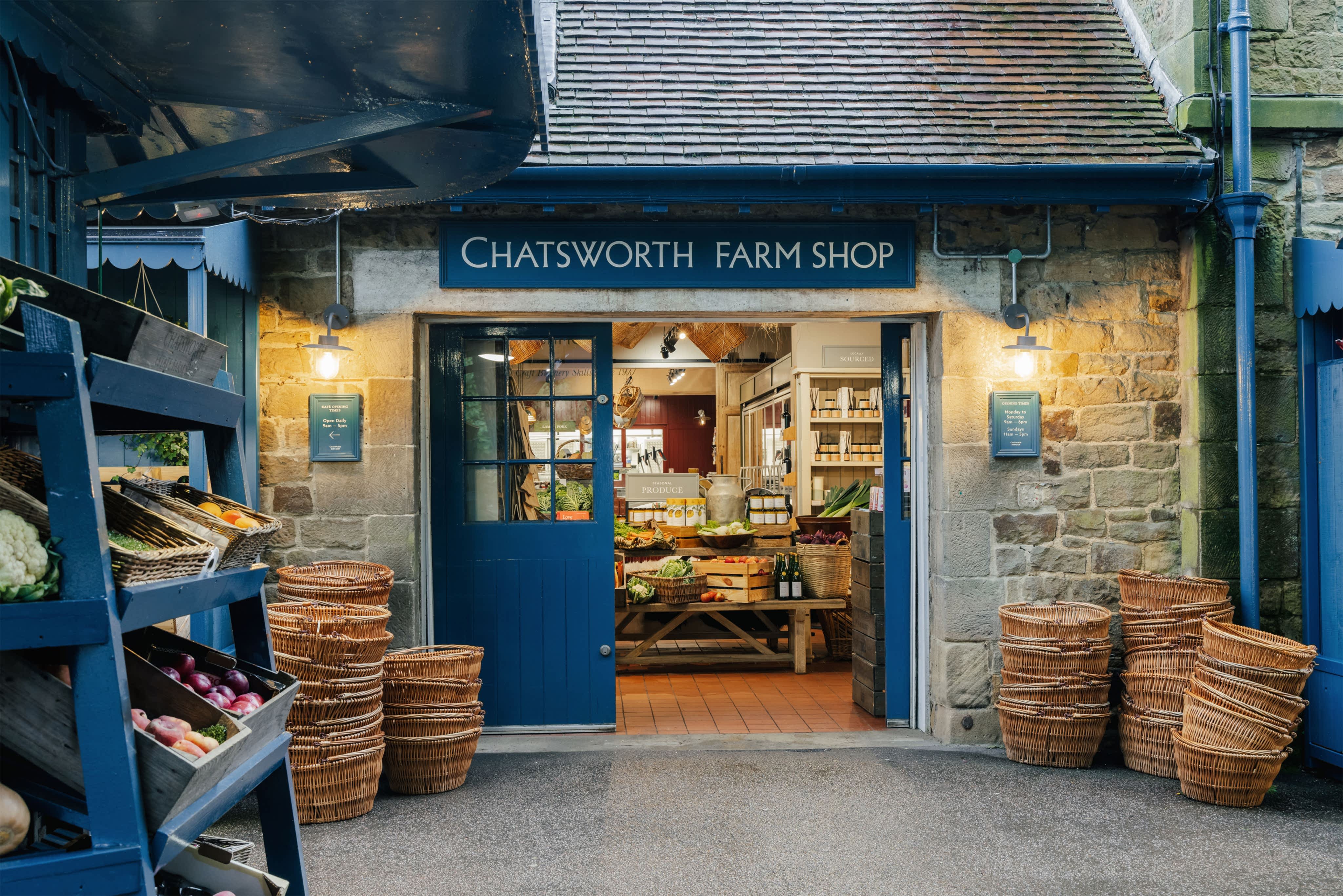
Chatsworth Farm Shop – how a revitalised brand experience can help elevate an established rural business
When it comes to brand experience, it’s not always about starting from scratch. If the heritage and advocacy is already in place, it’s a simple case of elevating, not fixing. The refreshed look and feel for Chatsworth Farm Shop celebrates its connection to the wider Chatsworth Estate, and renews its relevance for loyal customers for many years to come. Find out more
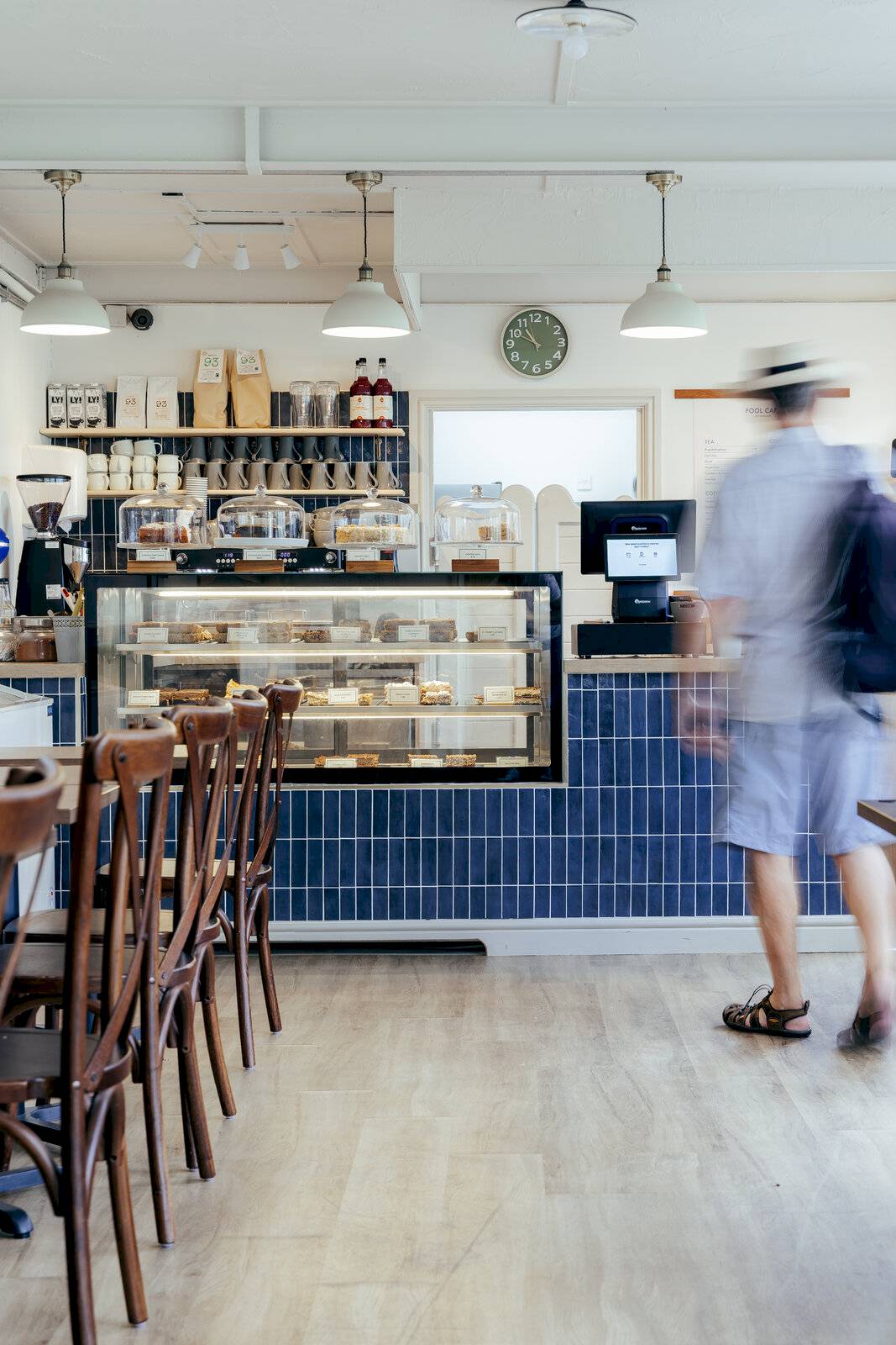
Hathersage Pool Cafe – An improved brand experience through refreshed interior design and brand identity
93ft recently completed an interior design and brand identity project to refresh the look and feel of Hathersage Pool Cafe, helping to positively impact the overall experience of the picturesque Peak District swimming spot for its many visitors throughout the year. Find out more

Kangaroo Works – Turning Sheffield industrial heritage into a modern brand and interior build-to-rent for its community of rental residents
93ft worked on the interior design and brand identity for Kangaroo Works, a mixed-used, residential development forming part of Sheffield city centre Heart of the City II regeneration. With a rich history and cultural heritage to explore, the 93ft team created an experience for residents that felt grounded in place and culture. Find out more
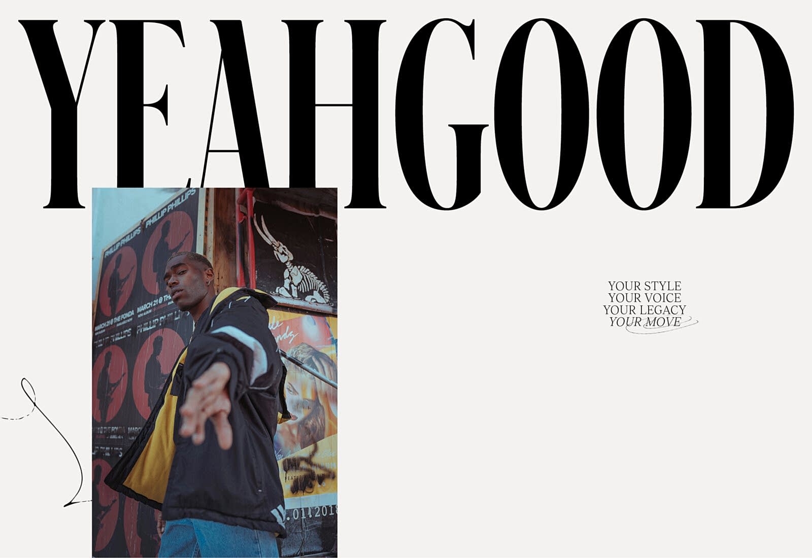
YEAH GOOD – Creating a bold brand identity that champions self-expression
Image isn’t everything, but it is Laura Simons’ thing. 93ft was tasked with executing a confident brand identity that enabled YEAH GOOD to make an ambitious statement of intent. Find out more
